June Newsletter Ideas & Examples for Bootstrap Devs
As June unfolds each year, Bootstrap developers gear up to infuse their newsletters with fresh and captivating elements. With the summer vibes setting in, there’s a plethora of inspiration to elevate your email campaigns and engage subscribers effectively. Whether you’re crafting sleek layouts, optimizing for mobile, or exploring seasonal hooks, here are some tailored June email newsletter ideas and examples to inspire your June projects. Each idea below pairs a copy-paste Bootstrap 5 snippet with an email-safe caveat so you know exactly what survives the trip to a real inbox. If you’re just getting started, our guide to email HTML templates with Bootstrap is a good companion for building components.
A quick note on Bootstrap and email: Bootstrap is excellent for prototyping newsletter layouts and for landing pages that promote your campaign. Production email is a different beast. Clients like Gmail and Outlook strip out JavaScript and most
<style>rules, so interactive Bootstrap components (carousels, modals, accordions, tooltips) and the full flex and grid system do not render reliably inside an inbox. Use Bootstrap to design and preview the look, then ship the actual email as table-based, inline-styled HTML. Every snippet below is framed with that prototype-then-export workflow in mind.
June Hooks and Observances at a Glance
Before you open the editor, line up your hooks. June is dense with observances that map cleanly onto campaign themes. Pick one or two anchors per send rather than cramming the whole calendar in, and write the subject line first so the layout serves the message.
| Date | Hook / observance | Subject-line idea |
|---|---|---|
| All month | Pride Month | “Celebrate Pride with us: stories, allies, and 20% back” |
| All month | Summer kickoff / longer days | “Summer’s here. Here’s your June lineup” |
| First Sunday | Father’s Day run-up | “Gift ideas Dad will actually use” |
| Jun 5 | World Environment Day | “Small swaps, big impact: our greener picks” |
| Jun 8 | World Oceans Day | “For the ocean: this week we give back” |
| Jun 19 | Juneteenth | “Honoring Juneteenth: what we’re reading and supporting” |
| 3rd Sunday | Father’s Day | “Last call: Father’s Day orders close Friday” |
| Jun 20/21 | Summer solstice | “Longest day, best deals: 24 hours only” |
| Jun 21 | International Yoga Day | “Stretch into summer: a free 7-day plan” |
A scannable hook table doubles as your editorial calendar. Map each row to a send date, decide whether it is a full campaign or a single content block, and you have June planned in one pass.
June Newsletter Ideas for Bootstrap Developers
1. Summer-Themed Header Components
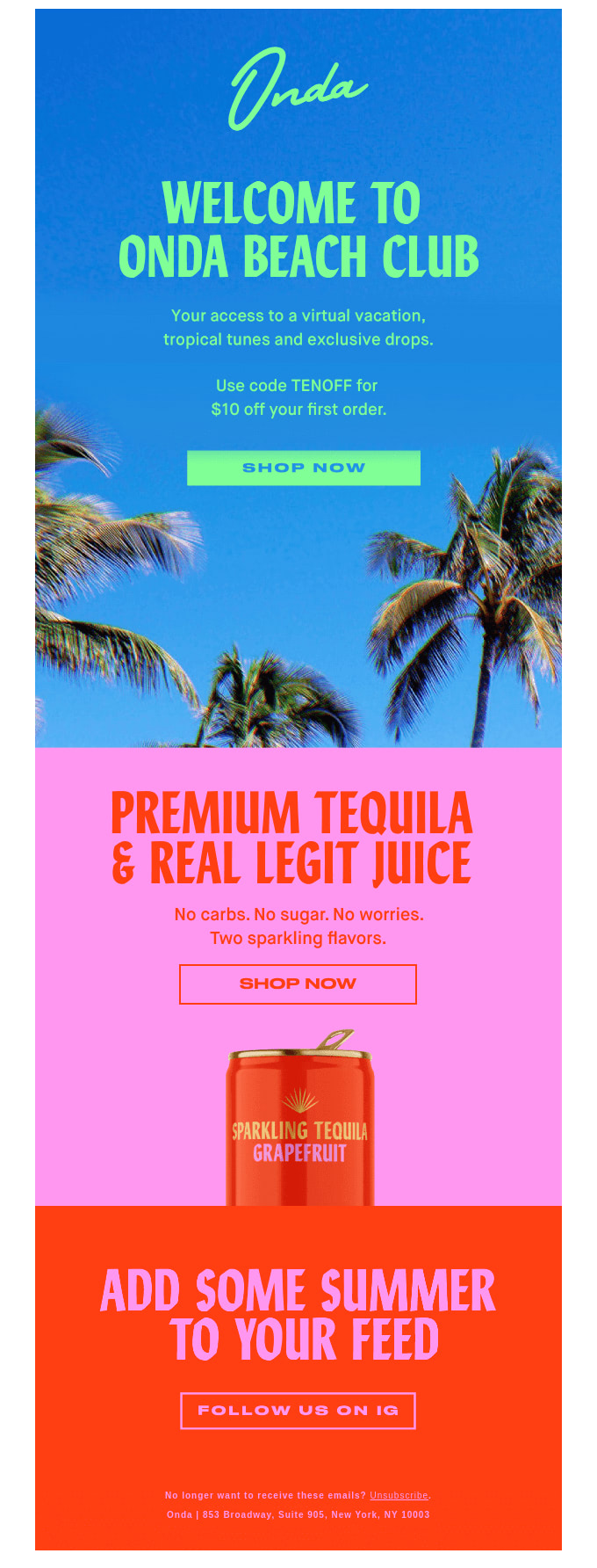
Embrace the essence of summer by designing a vibrant, seasonal header block. A high-contrast hero with a clear headline and one call to action sets the tone before a subscriber scrolls. Prototype it as a Bootstrap card or utility-styled block, then flatten it for the inbox.
<div class="card text-white bg-warning mb-3">
  <div class="card-body text-center p-5">
    <h5 class="card-title display-6">Summer Is Here</h5>
    <p class="card-text">Fresh arrivals, longer days, 20% off everything.</p>
    <a href="#" class="btn btn-light">Shop the Collection</a>
  </div>
</div>
Email-safe caveat: A static card like this is close to inbox-ready, but the layout (display-6, p-5, card) relies on class-based CSS that Outlook ignores. Export the headline and button into a single-cell <table> with inline styles, and use a bulletproof button (an anchor styled with inline padding and background) instead of .btn. Animated carousels never run in email: replace them with one static hero image or a lightweight animated GIF.
2. Mobile-First Newsletter Layouts
With more subscribers reading on phones during the summer months, prioritize mobile. Lead with a single clear column, keep images lightweight, and test how the layout reflows before you send. Bootstrap’s responsive grid system makes the prototype trivial: one column on phones, three on desktop.
<div class="row row-cols-1 row-cols-md-3 g-4">
  <div class="col">
    <div class="card h-100">
      <img src="feature1.jpg" class="card-img-top" alt="Feature one">
      <div class="card-body">
        <h5 class="card-title">This Month's Highlight</h5>
        <p class="card-text">A short, scannable blurb for mobile readers.</p>
      </div>
    </div>
  </div>
  <!-- Repeat for two more columns -->
</div>
Email-safe caveat: row-cols-* is the fastest way to mock a responsive grid, but the flex-based grid collapses inconsistently across clients. For the emailed version, recreate the columns as nested <table> cells set to width: 100% so they stack vertically on narrow screens, and keep the viewport meta tag (<meta name="viewport" content="width=device-width, initial-scale=1">) in the head for the clients that respect it.
3. Local Summer Events Module
Capitalize on outdoor activity with a “what’s on near you” module: nearby parks, trails, festivals, and markets. In the email, present the list as a clean stack of list-group items. The interactive parts (geolocation, maps, search) belong on a Bootstrap-powered landing page you link out to.
<ul class="list-group">
  <li class="list-group-item active" aria-current="true">This Weekend Near You</li>
  <li class="list-group-item d-flex justify-content-between">
    <span>Riverside Farmers Market</span>
    <span class="badge text-bg-success">Sat 9am</span>
  </li>
  <li class="list-group-item d-flex justify-content-between">
    <span>Sunset Trail Group Hike</span>
    <span class="badge text-bg-success">Sun 7pm</span>
  </li>
</ul>
Email-safe caveat: A list group is mostly borders and padding, so it converts well, but d-flex justify-content-between will not align in Outlook. Rebuild each row as a two-cell table (label left, time right) with inline text-align. Concrete landing-page content to link to: a filterable map where readers pick hiking difficulty, distance, and amenities, with a saved-favorites view. The email is the teaser; the page is the experience.
4. Summer Reading List Spotlight
Appeal to book lovers with a curated summer reading list. In the email, show a tidy grid of covers with one-line blurbs. Bootstrap’s card group is a fast prototype; the companion page can add genre filters, author pages, and reader reviews.
<div class="card-group">
  <div class="card">
    <img src="cover1.jpg" class="card-img-top" alt="Book one cover">
    <div class="card-body">
      <h5 class="card-title">Beach Read of the Month</h5>
      <p class="card-text">A breezy page-turner for the hammock.</p>
      <a href="#" class="btn btn-primary btn-sm">Read more</a>
    </div>
  </div>
  <!-- Repeat for more titles -->
</div>
Email-safe caveat: card-group uses flexbox to equalize heights, which inboxes do not honor, so cards will not sit side by side reliably. For the send, lay covers out in a fixed-width table row (two or three per row), give each image an explicit width, and link the whole cell. Concrete landing-page content: a genre-filtered grid with “add to list” buttons and a shareable summer reading bingo card.
5. Father’s Day and Gift Guide Block
Father’s Day lands in June, and a focused gift guide is one of the highest-converting blocks you can ship this month. Group picks by price tier or by persona (the griller, the gadget guy, the reader) and lead each with a clear price and button.
<div class="row row-cols-1 row-cols-md-3 g-3">
  <div class="col">
    <div class="card h-100 text-center">
      <img src="gift1.jpg" class="card-img-top" alt="Gift under 25">
      <div class="card-body">
        <h6 class="card-title">Under $25</h6>
        <p class="card-text fw-bold">The Grill Master Kit</p>
        <a href="#" class="btn btn-outline-primary btn-sm">Shop gift</a>
      </div>
    </div>
  </div>
  <!-- Repeat for "Under $50" and "Splurge" tiers -->
</div>
Email-safe caveat: Same grid rules apply: prototype with row-cols, ship as stacked table cells. Watch the deadline messaging closely. A gift guide is useless if it arrives after shipping cutoffs, so put the order-by date in the subject line and a text-bg-danger badge in the prototype, then carry that urgency into the email as inline-styled colored text.
6. Team Project Update Roundup
For B2B and product newsletters, a “what we shipped this month” roundup keeps subscribers engaged through the slower summer stretch. Summarize releases in the email, then link to a Bootstrap-powered dashboard for the full picture. A progress bar gives the recap a quick visual anchor.
<h6>Q2 Roadmap Progress</h6>
<div class="progress" role="progressbar" aria-valuenow="68" aria-valuemin="0" aria-valuemax="100">
  <div class="progress-bar bg-success" style="width: 68%;">68%</div>
</div>
Email-safe caveat: A .progress bar is just nested divs, so it can be rebuilt as a two-cell table where the filled cell has an inline background color and a set width. Avoid relying on the rounded corners and label centering that Bootstrap’s CSS provides. Concrete landing-page content: a live dashboard with per-feature status, assignable tasks, and a changelog feed, all of which need the interactivity the inbox cannot offer.
In summary, June presents an exciting opportunity for Bootstrap developers to elevate their newsletters with summer-inspired designs and seasonal hooks. By leveraging these tailored ideas (and pairing Bootstrap’s prototyping speed with email-safe production markup), you can create campaigns that captivate subscribers and drive results.
For inbox-ready markup, see our responsive email templates for Gmail. For more in this monthly series, see May’s email campaign ideas and July’s newsletter ideas. And for a deeper how-to, our guide on email marketing with Bootstrap for developers walks through building campaigns end to end.
FAQ
What should a June email newsletter include?
June works best around summer-kickoff and seasonal hooks: a summer-themed header, a mobile-first layout, a local events module, a summer reading list, and a Father’s Day gift guide. Tie sends to June observances such as World Environment Day (June 5), World Oceans Day (June 8), Juneteenth (June 19), the summer solstice (June 20 or 21), International Yoga Day (June 21), and Pride Month throughout. Use Bootstrap cards, list groups, and grids to give each block a clean, responsive prototype.
What are good June subject lines and observances to plan around?
Anchor June campaigns to one or two of these: Pride Month, the summer solstice, Father’s Day (third Sunday), Juneteenth, World Environment Day, World Oceans Day, and International Yoga Day. The hooks-and-observances table above pairs each with a ready subject-line idea. Write the subject first, then build the layout to serve it, and put any shipping or order-by deadlines (especially for Father’s Day) directly in the subject line.
Can I use Bootstrap to build production email newsletters?
Use Bootstrap to prototype and preview your newsletter layouts, but ship the actual email as table-based, inline-styled HTML. Email clients like Gmail and Outlook strip JavaScript and most CSS, so Bootstrap’s interactive components and the full flex and grid system will not render reliably in the inbox. Design in Bootstrap, then export each block to nested tables with inline styles.
How do I convert a Bootstrap card or grid into an email-safe block?
Recreate the structure with <table> elements: a card becomes a single-cell table with an inline-styled border, padding, and a bulletproof anchor button; a row-cols grid becomes table rows where each cell is width: 100% so it stacks on mobile. Move every Bootstrap class to inline style attributes, swap flex alignment for text-align and valign, and replace .btn with an anchor that has inline padding and background color.
How can Bootstrap developers ensure cross-browser and cross-client compatibility?
Test your layouts across multiple browsers for web pages, and across major email clients for newsletters. Use inline CSS and well-supported, table-based HTML for email, lean on feature detection and polyfills on the web, and send seed tests to Gmail, Outlook, and Apple Mail before any campaign goes out.
How can Bootstrap developers stay updated on the latest trends and updates?
Stay connected with the Bootstrap community through online forums, social media groups, and developer conferences. Follow Bootstrap’s official documentation and GitHub repository for announcements and releases: the current stable line is Bootstrap 5.3, with 5.3.8 the latest patch.
What resources are available to enhance Bootstrap and email skills?
Explore online tutorials, courses, and documentation to deepen your understanding of Bootstrap. Participate in open-source projects, contribute to the codebase, and engage with the developer community to learn from others and share what you build. Our guides on email HTML templates with Bootstrap and responsive email templates for Gmail cover the conversion details in depth.
Build your Bootstrap theme
Design a custom Bootstrap 5 theme visually with a live preview, then export clean Sass or CSS.
Open the Builder