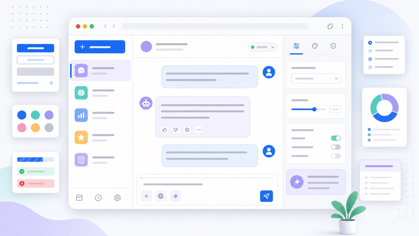
How to Build an AI Chat Interface with Bootstrap 5
An AI feature still has to feel like the rest of your product. Bootstrap is a good fit for that job because the pieces an assistant needs are already there: cards, forms, buttons, badges, alerts, spinners, dropdowns, offcanvas panels, and a responsive grid. This guide shows how to build a polished AI chat interface with Bootstrap 5 while keeping the markup accessible, themeable, and easy to customize.
Start with the layout
Most AI screens are a variation on the same pattern: a conversation, a composer, and optional side context. On small screens the conversation should take the full width. On larger screens a sidebar can hold history, sources, settings, or a prompt library.
<main class="container-fluid py-3">
  <div class="row g-3">
    <aside class="col-lg-3 d-none d-lg-block">
      <div class="list-group">
        <a class="list-group-item list-group-item-action active" href="#">Current chat</a>
        <a class="list-group-item list-group-item-action" href="#">Theme ideas</a>
        <a class="list-group-item list-group-item-action" href="#">Saved prompts</a>
      </div>
    </aside>

    <section class="col-lg-9">
      <div class="card shadow-sm">
        <div class="card-header d-flex align-items-center justify-content-between">
          <div>
            <h1 class="h5 mb-0">Bootstrap theme assistant</h1>
            <p class="small text-body-secondary mb-0">Ask for palette, spacing, or component ideas.</p>
          </div>
          <span class="badge text-bg-success">Online</span>
        </div>

        <div class="card-body">
          <!-- messages go here -->
        </div>

        <div class="card-footer">
          <!-- composer goes here -->
        </div>
      </div>
    </section>
  </div>
</main>
That is intentionally plain Bootstrap: grid for layout, card for the shell, list group for history, and badge for status. The theme can change later without rewriting the screen.
Mark up the conversation
Use a list for messages. Each item is a real block with a clear author, timestamp, and content area. Align the user’s messages to the end and the assistant’s messages to the start:
<ol class="list-unstyled d-flex flex-column gap-3 mb-0">
  <li class="d-flex gap-2">
    <div class="rounded-circle text-bg-secondary d-inline-flex align-items-center justify-content-center flex-shrink-0" style="width: 36px; height: 36px;">
      AI
    </div>
    <div class="bg-body-tertiary border rounded-3 p-3">
      <div class="small text-body-secondary mb-1">Assistant · just now</div>
      <p class="mb-0">Try a warmer primary color, softer cards, and a little more vertical spacing.</p>
    </div>
  </li>

  <li class="d-flex justify-content-end">
    <div class="bg-primary text-white rounded-3 p-3" style="max-width: 42rem;">
      <div class="small opacity-75 mb-1">You</div>
      <p class="mb-0">Make the theme feel more editorial and less like a dashboard.</p>
    </div>
  </li>
</ol>
The important details are the spacing utilities (gap-3, p-3), the neutral surface (bg-body-tertiary), and the semantic color for the user’s message (bg-primary). If you later change $primary or the body colors, the chat inherits the new look.
Add a composer that feels like a form
The prompt box is the most important control on the page, so build it from standard form pieces. A textarea gives room for longer prompts, while input groups and buttons keep actions close by.
<form class="d-flex flex-column gap-2">
  <label for="prompt" class="form-label fw-semibold">Message</label>
  <textarea
    id="prompt"
    class="form-control"
    rows="3"
    placeholder="Ask for a color palette, component layout, or Sass variable suggestion"></textarea>

  <div class="d-flex flex-wrap align-items-center justify-content-between gap-2">
    <div class="d-flex flex-wrap gap-2">
      <button class="btn btn-outline-secondary btn-sm" type="button">Improve tone</button>
      <button class="btn btn-outline-secondary btn-sm" type="button">Suggest colors</button>
      <button class="btn btn-outline-secondary btn-sm" type="button">Shorten</button>
    </div>
    <button class="btn btn-primary" type="submit">Send</button>
  </div>
</form>
Those small prompt chips are just buttons. That matters: users can tab to them, screen readers announce them correctly, and you do not need custom keyboard handling.
Show loading and streaming states
AI interfaces spend a lot of time between “sent” and “done”. Make those states explicit with built-in Bootstrap feedback:
<div class="alert alert-info d-flex align-items-center gap-2 mb-3" role="status">
  <div class="spinner-border spinner-border-sm" aria-hidden="true"></div>
  <span>Drafting a response...</span>
</div>
For a streaming answer, keep the message bubble in place and append text inside it. Add aria-live="polite" to the response region so assistive technology can announce updates without interrupting the user:
<div class="bg-body-tertiary border rounded-3 p-3" aria-live="polite">
  <div class="small text-body-secondary mb-1">Assistant</div>
  <p class="mb-0">Here is a Bootstrap variable set for a calmer theme...</p>
</div>
Avoid moving the whole card, jumping the composer, or replacing the entire page during loading. A stable layout makes the feature feel much more trustworthy.
Use offcanvas for context and settings
AI screens often need secondary controls: model settings, tone controls, system instructions, or source documents. On desktop you can place them in a sidebar; on mobile, use an offcanvas panel:
<button class="btn btn-outline-secondary" type="button" data-bs-toggle="offcanvas" data-bs-target="#assistantSettings">
  Settings
</button>

<div class="offcanvas offcanvas-end" tabindex="-1" id="assistantSettings" aria-labelledby="assistantSettingsLabel">
  <div class="offcanvas-header">
    <h2 class="offcanvas-title h5" id="assistantSettingsLabel">Assistant settings</h2>
    <button type="button" class="btn-close" data-bs-dismiss="offcanvas" aria-label="Close"></button>
  </div>
  <div class="offcanvas-body">
    <label for="tone" class="form-label">Tone</label>
    <select id="tone" class="form-select">
      <option>Clear and direct</option>
      <option>Friendly</option>
      <option>Technical</option>
    </select>
  </div>
</div>
Because Bootstrap handles focus management for offcanvas components, you get a better keyboard experience than a hand-rolled panel.
Make the assistant match your Bootstrap theme
The fastest way to make an AI interface look integrated is to avoid hardcoded colors. Build custom pieces on Bootstrap variables:
.chat-bubble {
  background: var(--bs-tertiary-bg);
  color: var(--bs-body-color);
  border: 1px solid var(--bs-border-color);
  border-radius: var(--bs-border-radius-lg);
}

.chat-bubble-user {
  background: var(--bs-primary);
  color: var(--bs-white);
}
Now the chat follows your brand colors, dark mode, border radius, and surface color. If you need to change those values globally, use the Bootstrap Sass variable system or tune them visually in the builder.
Keep AI output contained
If your assistant returns Markdown or HTML-like content, render it in a constrained area and keep Bootstrap’s typography classes in control:
<div class="chat-bubble">
  <div class="prose">
    <h2 class="h5">Suggested theme</h2>
    <p>Use a deep blue primary, neutral cards, and tighter button radius.</p>
    <pre class="bg-dark text-white rounded-3 p-3"><code>$primary: #3157d5;</code></pre>
  </div>
</div>
Treat model output like user content: sanitize anything that becomes HTML, do not run scripts from it, and do not let it inject arbitrary classes into your page shell. Bootstrap gives you the visual vocabulary; your app still decides what is allowed.
Accessibility checklist
Before shipping an AI chat UI, check the basics:
- The composer has a visible label, not only placeholder text.
- The send button is a real
<button type="submit">. - Loading states use
role="status"or anaria-liveregion. - Message authors are visible in text, not only color.
- Buttons and prompt chips have clear names.
- Offcanvas or modal settings return focus when closed.
- Color contrast still passes after you customize the theme.
For color work, pair this with the guide to customizing Bootstrap colors and the dark mode guide.
Example: a full chat card
Here is the whole pattern compressed into one card:
<section class="card shadow-sm">
  <header class="card-header d-flex align-items-center justify-content-between">
    <h1 class="h5 mb-0">Theme assistant</h1>
    <button class="btn btn-outline-secondary btn-sm" type="button">New chat</button>
  </header>

  <div class="card-body d-flex flex-column gap-3" style="min-height: 28rem;">
    <div class="align-self-start bg-body-tertiary border rounded-3 p-3">
      <p class="small text-body-secondary mb-1">Assistant</p>
      <p class="mb-0">Tell me the brand, audience, and mood you want.</p>
    </div>

    <div class="align-self-end bg-primary text-white rounded-3 p-3">
      <p class="small opacity-75 mb-1">You</p>
      <p class="mb-0">A calm SaaS dashboard for finance teams.</p>
    </div>
  </div>

  <footer class="card-footer">
    <form class="input-group">
      <label for="message" class="visually-hidden">Message</label>
      <input id="message" class="form-control" placeholder="Type your message">
      <button class="btn btn-primary" type="submit">Send</button>
    </form>
  </footer>
</section>
From there, customize the theme rather than the markup. Change $primary, $border-radius, $body-bg, and $font-family-base, and the chat immediately starts feeling like part of your product instead of a bolted-on widget.
FAQ
Is Bootstrap good for building an AI chat interface?
Yes. Bootstrap already includes the layout, forms, buttons, cards, feedback states, responsive utilities, and interactive components an AI chat screen needs. You can build the interface quickly and theme it with standard Bootstrap variables.
How do I style chat bubbles in Bootstrap?
Use spacing, background, border, and radius utilities for the first version: bg-body-tertiary border rounded-3 p-3 for assistant messages and bg-primary text-white rounded-3 p-3 for user messages. Move repeated styles into a small .chat-bubble class once the pattern repeats.
How should I show an AI loading state?
Use a stable message area plus a Bootstrap spinner or alert with role="status". Keep the composer in place, avoid page jumps, and update the response area with aria-live="polite" if text streams in gradually.
How do I make an AI widget support dark mode?
Use Bootstrap CSS variables such as --bs-body-bg, --bs-body-color, --bs-border-color, and --bs-primary instead of hardcoded colors. Then the widget follows data-bs-theme="dark" automatically.
Try it in the builder
Make these changes visually with a live preview, then export clean Bootstrap Sass or CSS.
Open the Builder