AI Prompts for Bootstrap Themes: From Brief to Sass
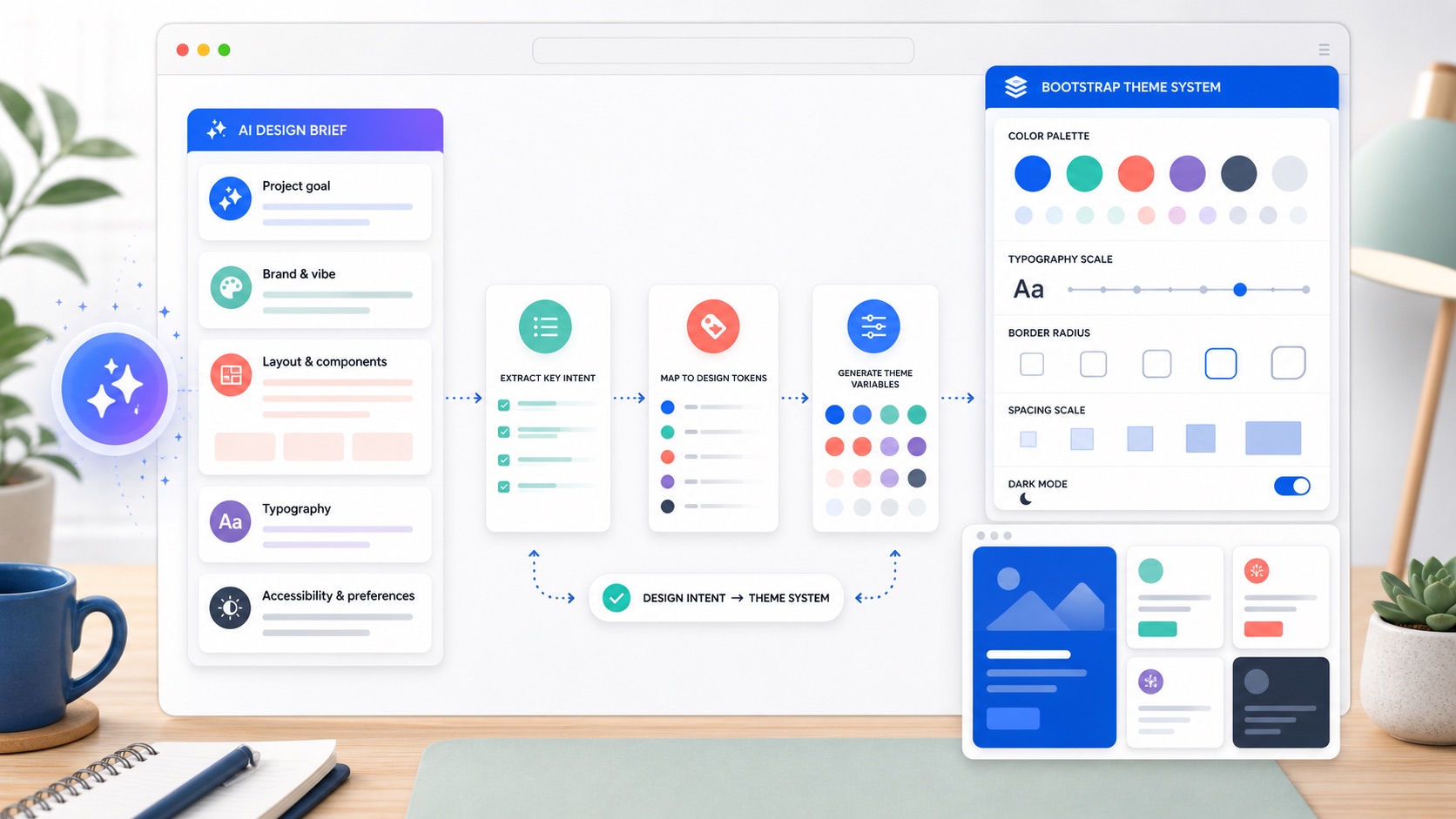
AI can help you explore Bootstrap theme ideas quickly, but the output is only useful when it turns into real Bootstrap variables. The trick is to ask for decisions Bootstrap understands: colors, typography, radius, spacing, shadows, color modes, and component tone. This guide shows a practical workflow for using AI to shape a Bootstrap 5 theme, then converting the result into Sass variables you can preview and export.
Start with a design brief, not a vague prompt
Poor prompts produce mood-board language. Good prompts produce decisions. Before asking for theme ideas, write a short brief with the same information you would give a designer:
Project: B2B analytics dashboard
Audience: finance and operations teams
Mood: calm, trustworthy, clear, not playful
Brand color: #3157d5
UI density: compact, data-heavy
Needs: light and dark mode, accessible contrast, cards, tables, forms
Then ask for Bootstrap-specific output:
Suggest a Bootstrap 5 theme direction for this brief.
Return:
1. Primary, secondary, success, warning, danger, info, light, and dark colors.
2. Body and heading font recommendations.
3. Border radius, spacer, and shadow direction.
4. Notes for cards, buttons, forms, and tables.
5. A Sass variable snippet using Bootstrap variable names.
That last line matters. You are not asking for a pretty description; you are asking for values that can become a theme.
Ask for Bootstrap variables directly
Bootstrap themes are built from variables. Encourage the model to use the names Bootstrap already expects:
Convert this style direction into Bootstrap 5 Sass variables.
Use real Bootstrap variable names such as:
$primary, $secondary, $success, $warning, $danger, $info,
$body-bg, $body-color, $font-family-base, $headings-font-family,
$border-radius, $spacer, $card-border-radius, $btn-border-radius,
$input-border-radius, $box-shadow.

Keep the result concise and include only variables that define the look.
A useful answer should look more like this:
$primary: #3157d5;
$secondary: #64748b;
$success: #208a63;
$warning: #c47a12;
$danger: #c2414b;
$info: #287f9f;

$body-bg: #f7f9fc;
$body-color: #172033;
$font-family-base: "Inter", system-ui, sans-serif;
$headings-font-family: "Inter", system-ui, sans-serif;

$border-radius: 0.65rem;
$card-border-radius: 0.85rem;
$btn-border-radius: 0.55rem;
$input-border-radius: 0.5rem;
$spacer: 1rem;
$box-shadow: 0 0.75rem 2rem rgba(15, 23, 42, 0.08);
You can paste those values into your Sass override file or adjust them visually in the bootstrap.build editor.
Put the variables in the right order
AI-generated Sass is often close, but it may place variables after Bootstrap is imported. That will not work. Bootstrap variables use !default, so your overrides must come after functions and before the rest of Bootstrap:
@import "bootstrap/scss/functions";

// theme variables from your brief
$primary: #3157d5;
$body-bg: #f7f9fc;
$body-color: #172033;
$border-radius: 0.65rem;

@import "bootstrap/scss/variables";
@import "bootstrap/scss/maps";
@import "bootstrap/scss/mixins";
@import "bootstrap/scss/root";
@import "bootstrap/scss/bootstrap";
For a deeper explanation, read Bootstrap Sass variables and the override order. It is the difference between “the theme compiled” and “nothing changed”.
Use AI for exploration, then validate the system
AI is strongest at producing options quickly. Bootstrap is strongest at turning one chosen direction into a consistent UI. A good workflow looks like this:
- Ask for three distinct theme directions from the same brief.
- Choose one direction, or combine the strongest parts of two.
- Convert it into Bootstrap Sass variables.
- Preview it across real components: buttons, forms, cards, navbars, alerts, tables, and modals.
- Fix contrast, spacing, and component edge cases.
- Export Sass or compiled CSS.
The preview step is non-negotiable. A color can look good in isolation and still fail on a button hover state, subtle alert, disabled form control, or dark-mode surface.
Prompt for accessible colors
When asking for colors, make contrast explicit:
Create a Bootstrap 5 color palette for this brief.
Requirements:
- Primary buttons must have readable text.
- Body text must be high contrast on the body background.
- Avoid low-contrast pastel text.
- Include hover-friendly primary and link colors.
- Explain any color that may need manual contrast checking.
Then test it in real UI. Bootstrap computes many derived states from your base colors, but you still need to inspect the result. Start with the Bootstrap color customization guide if you want to understand how $primary, $theme-colors, subtle backgrounds, and emphasis colors connect.
Prompt for typography and spacing
Theme prompts tend to over-focus on color. Ask for type and spacing too:
Suggest Bootstrap typography and spacing variables for a professional documentation site.
Return font-family-base, headings-font-family, font-size-base, line-height-base,
headings-font-weight, spacer, border-radius, and any component-specific radius notes.
Keep the theme readable on long pages.
Useful outputs map to variables:
$font-family-base: "Source Sans 3", system-ui, sans-serif;
$headings-font-family: "Source Serif 4", Georgia, serif;
$font-size-base: 1rem;
$line-height-base: 1.65;
$headings-font-weight: 700;
$spacer: 1.125rem;
$border-radius: 0.4rem;
Typography changes the whole feel of Bootstrap. The full workflow is in how to change fonts and typography in Bootstrap 5.
Prompt for dark mode
Bootstrap 5.3 has built-in color modes, so ask for dark values as part of the same theme:
Add dark-mode Bootstrap Sass variables for this theme.
Include body background, body text, border color, card surface, and muted text.
Keep the dark mode calm and readable, not pure black.
That might produce variables like:
$body-bg-dark: #0f172a;
$body-color-dark: #d8dee9;
$border-color-dark: #26324a;
$body-secondary-color-dark: #9aa7bd;
$body-tertiary-bg-dark: #151f33;
Use those with data-bs-theme="dark", then inspect cards, forms, dropdowns, and alerts. The implementation details are in how to add dark mode to a Bootstrap 5 theme.
Ask for component-level refinements
Once the global theme works, ask for refinements by component. This keeps the theme coherent while fixing the places that matter most:
Given these Bootstrap variables, suggest small component-level tweaks for a SaaS dashboard.
Focus on cards, tables, buttons, navbars, and forms.
Return only Bootstrap Sass variable overrides, and explain why each one helps.
Component-level variables might include:
$card-border-width: 0;
$card-box-shadow: 0 0.5rem 1.5rem rgba(15, 23, 42, 0.06);
$table-cell-padding-y: 0.85rem;
$btn-padding-y: 0.55rem;
$btn-padding-x: 1rem;
$input-padding-y: 0.6rem;
Keep this layer small. If every component gets a special case, the theme starts to feel less like a system.
Clean up AI-generated Sass
Before you ship, review the generated variables:
- Remove variables that do not exist in Bootstrap.
- Remove duplicate definitions.
- Keep comments short and useful.
- Put all overrides before Bootstrap imports.
- Prefer global variables first, then component-specific variables.
- Check dark mode separately from light mode.
- Keep the final file small enough that a teammate can scan it.
If the result is a large pile of values, ask for a smaller version:
Reduce this Bootstrap theme to the 20 most important Sass variables.
Prioritize variables that change the whole visual system.
Remove narrow component tweaks unless they are essential.
Preview and export the theme
The safest way to finish is to test the variables against real Bootstrap components. In the builder, adjust the AI-suggested values with a live preview, compare light and dark mode, and export either Sass or compiled CSS. If you export Sass, place it in the override slot explained above. If you export CSS, link it directly in your page.
For the handoff details, use how to export a custom Bootstrap theme. For the bigger theming map, start with how to customize Bootstrap 5.
FAQ
Can AI create a Bootstrap theme?
AI can suggest a strong theme direction and draft Bootstrap Sass variables, but you should still preview the result across real components, check contrast, and remove variables that do not exist or do not help.
What should I ask AI for when designing a Bootstrap theme?
Ask for Bootstrap-specific decisions: $primary, $theme-colors, body colors, fonts, spacing, border radius, shadows, dark-mode values, and component notes for buttons, cards, forms, tables, and navigation.
Where do AI-generated Bootstrap variables go?
Put them after @import "bootstrap/scss/functions"; and before Bootstrap’s variables, maps, mixins, and main imports. Variables placed after Bootstrap is imported will usually be too late to change the compiled theme.
Should I use AI output as final CSS?
Usually no. Use AI output as a starting point, then convert it into Bootstrap Sass variables or tune it in a visual builder. That keeps the theme framework-native, easier to maintain, and consistent across components.
Try it in the builder
Make these changes visually with a live preview, then export clean Bootstrap Sass or CSS.
Open the Builder