shadcn Themes and Tailwind Themes: Best Free Sources (2026)
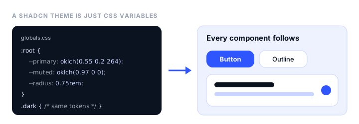
A shadcn/ui theme is a set of CSS variables: a few dozen color tokens, a border radius, and sometimes fonts, which every shadcn component reads. Swap the variables and the whole interface changes, from buttons to charts to the sidebar. Tailwind CSS themes work the same way since Tailwind v4, through CSS variables declared with @theme. This guide explains how both work, lists the best places to get free shadcn and Tailwind themes in 2026, and shows how to install a theme with one command.
What changed in 2026
If you’re following an older tutorial, three things are different now:
- The official themes page is gone.
ui.shadcn.com/themesnow redirects to shadcn/create, a visual builder that produces a short preset code instead of CSS to copy. - Presets and
shadcn apply. Since shadcn CLI v4 (March 2026), a preset bundles colors, radius, fonts, and icon library into one code.npx shadcn@latest apply --preset <code>switches an existing project to it, and--only themeapplies just the colors. - Tailwind Plus is closed to new customers. When Tailwind Labs joined Shopify on September 9, 2026, it stopped selling Tailwind Plus (formerly Tailwind UI) to new buyers. Tailwind CSS itself stays free and MIT-licensed.
How a shadcn theme works
A shadcn project keeps its theme in the global CSS file, usually app/globals.css. The tokens come in pairs: a background color and the text color that sits on it.
:root {
  --radius: 0.625rem;
  --background: oklch(1 0 0);
  --foreground: oklch(0.145 0 0);
  --primary: oklch(0.205 0 0);
  --primary-foreground: oklch(0.985 0 0);
  --secondary: oklch(0.97 0 0);
  --secondary-foreground: oklch(0.205 0 0);
  --muted: oklch(0.97 0 0);
  --muted-foreground: oklch(0.556 0 0);
  --accent: oklch(0.97 0 0);
  --accent-foreground: oklch(0.205 0 0);
  --destructive: oklch(0.577 0.245 27.325);
  --border: oklch(0.922 0 0);
  --input: oklch(0.922 0 0);
  --ring: oklch(0.708 0 0);
  /* plus --card, --popover, --chart-1 to --chart-5, and --sidebar-* */
}

.dark {
  --background: oklch(0.145 0 0);
  --foreground: oklch(0.985 0 0);
  --primary: oklch(0.922 0 0);
  --primary-foreground: oklch(0.205 0 0);
  /* ...the same tokens with dark values */
}
These are the default “neutral” values from the shadcn theming docs. A few things to know:
- Colors are in oklch, a color format where lightness is the first number. It makes it easy to build shades that look evenly spaced. Older themes written for Tailwind v3 use HSL values instead.
.darkholds the dark-mode values. Toggling thedarkclass on<html>switches every token at once.--radiussets one base radius, and shadcn derivesrounded-smup torounded-4xlfrom it, so changing it reshapes every component.- An
@theme inlineblock maps each token to a Tailwind utility, for example--color-primary: var(--primary);, which is what makes classes likebg-primaryandtext-muted-foregroundwork.
Because everything goes through these variables, “installing a theme” just means replacing the values in :root and .dark. Your components don’t change.
Where to get shadcn themes
| Source | What you get | Price | Install |
|---|---|---|---|
| tweakcn | Visual editor with live preview, about 40 presets, contrast checker, AI generation | Free; Pro $8/mo for unlimited AI | CSS or registry command |
| Strict Themes | 13 complete design systems with light and dark modes, page prompts, and a DESIGN.md file for AI coding agents | Free, MIT | shadcn add from a registry URL |
| shadcn/create | The official builder: style, colors, fonts, radius, and icons as a preset code | Free | init --preset or apply --preset |
| Shadcnblocks themes | 39 themes with light and dark modes | Free (blocks are paid) | shadcn add @shadcnblocks/theme/... |
| shadcn.io themes | 59 presets grouped by mood | Free | Preset code |
| shadcn/studio | Theme generator with style presets and Figma sync | Free core; Pro lifetime license | shadcn add |
| 21st.dev themes | Community-made themes | Free to browse | Copy CSS |
tweakcn: best theme editor
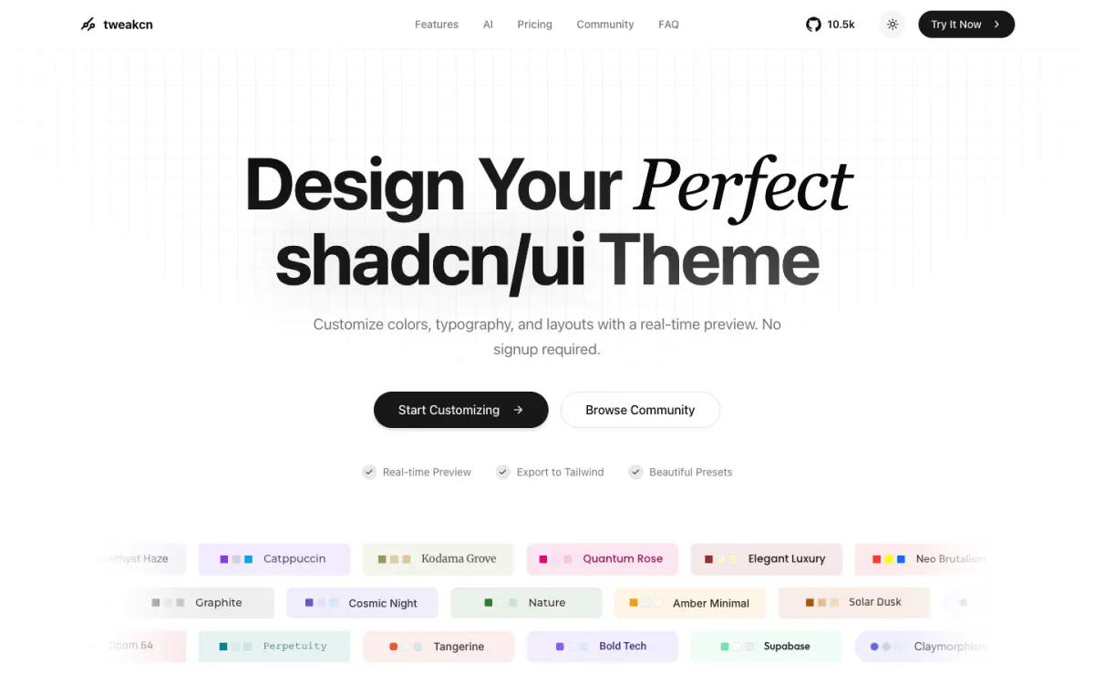
tweakcn is the most popular shadcn theme tool and ranks first for the search. You pick a preset (Catppuccin, Vercel, Supabase, Claude, and dozens more) or start from scratch, adjust colors, radius, fonts, and shadows while a dashboard preview updates, and check contrast as you go. It exports Tailwind v4 (oklch) or v3 (HSL) CSS, or a registry command. Everything except AI theme generation is free without an account, and it’s open source.
Strict Themes: best for AI coding agents
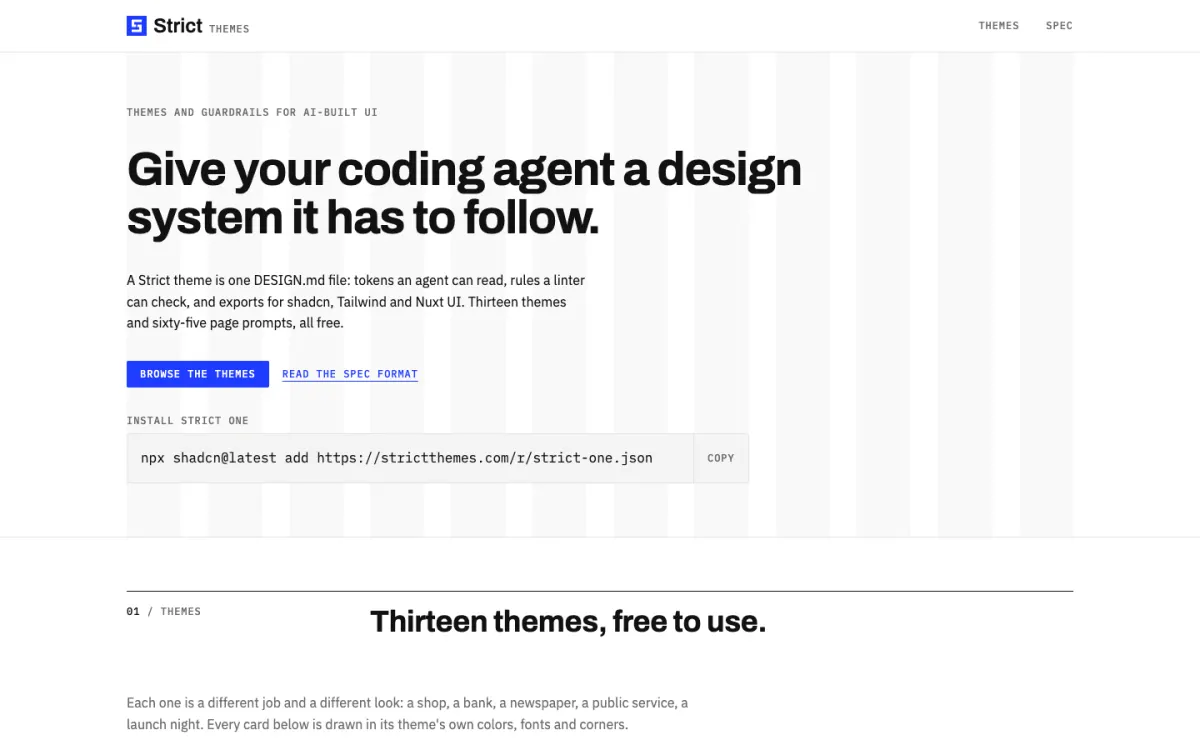
Strict Themes goes further than colors. Each of its 13 themes is a complete design system: colors, typography, spacing, and component rules in a DESIGN.md file that coding agents such as Claude Code, Cursor, and Codex read before writing UI, plus five ready page prompts per theme. Every theme exports to a shadcn registry item, a Tailwind v4 theme, Nuxt UI, and W3C design tokens. It’s free and MIT-licensed:
npx shadcn@latest add https://strictthemes.com/r/strict-one.json
How the DESIGN.md side works is covered in our guide to giving your coding agent a design system.
shadcn/create: the official option
shadcn/create replaced the old themes page. Choose a style, base color, accent, fonts, radius, and icon library, and it gives you a preset code. Use it to start a new project, or to restyle an existing one:
npx shadcn@latest init --preset <code>                 # new project
npx shadcn@latest apply --preset <code>                # existing project
npx shadcn@latest apply --preset <code> --only theme   # colors only
The base colors are now Neutral, Stone, Zinc, Mauve, Olive, Mist, and Taupe; Gray and Slate are no longer listed.
More collections
- Shadcnblocks has 39 free themes with light and dark modes, installable from its namespaced registry.
- shadcn.io groups 59 free presets by mood, built from shadcn’s own palettes.
- shadcn/studio is a generator with several style presets, icon library choice, and Figma sync, with paid Pro features.
- 21st.dev collects community themes alongside its component library.
How to install a shadcn theme
There are three ways, depending on where the theme comes from.
1. From a registry URL (Strict Themes, tweakcn, Shadcnblocks, shadcn/studio):
npx shadcn@latest add https://strictthemes.com/r/strict-one.json
The CLI writes the theme’s light and dark tokens into your global CSS and, for full design systems, the fonts and radius too.
2. From a preset code (shadcn/create, shadcn.io):
npx shadcn@latest apply --preset <code> --only theme
3. By copying CSS. Replace the :root and .dark blocks in your global CSS with the theme’s. Keep the @theme inline block, which doesn’t change between themes.
Commit your work first, since the CLI edits files in place, and check that components.json has "cssVariables": true. Projects created with --no-css-variables use hard-coded utility classes and can’t switch themes this way without reinstalling components.
Make your own shadcn theme
Start from a theme close to what you want in tweakcn or shadcn/create, then adjust:
- Set
--primaryto your brand color, and pick a--primary-foregroundwith enough contrast for button text (aim for 4.5:1). - Keep the neutrals neutral. Most of the interface is
--background,--muted,--border, and--foreground; tinting them slightly toward your brand hue looks polished, while strong colors look busy. - Do the dark mode on purpose. Don’t invert the light values. Dark themes need lighter primaries and lower-contrast borders.
- Add tokens you need, such as
--warning, under:rootand.dark, then map them in@theme inline(--color-warning: var(--warning);) to getbg-warning.
Tailwind themes
How theming works in Tailwind CSS v4
Tailwind v4 (4.3.5 at the time of writing) moved configuration from tailwind.config.js into CSS. A theme is a set of variables in an @theme block, and each namespace creates utilities:
@import "tailwindcss";

@theme {
  --color-brand-500: oklch(0.62 0.19 264);
  --color-brand-600: oklch(0.55 0.2 264);
  --font-sans: "Inter", system-ui, sans-serif;
  --radius-card: 1rem;
}
That adds bg-brand-500, text-brand-600, font-sans, and rounded-card. The namespaces include --color-*, --font-*, --text-*, --radius-*, --shadow-*, --spacing-*, and --breakpoint-*. To drop Tailwind’s default colors and use only your own, add --color-*: initial; first. Old JavaScript configs still work if you load them with @config, but they’re no longer picked up automatically. Details are in the Tailwind theme docs.
A shadcn theme is a Tailwind theme with an extra layer: semantic tokens like --primary that switch with dark mode, mapped into @theme inline.
Where to get Tailwind themes
- daisyUI ships 35 built-in themes, switched with a
data-themeattribute, and a@plugin "daisyui/theme"block for custom ones. It’s the quickest way to get many complete themes. - Flowbite has five prebuilt themes (Default, Minimal, Enterprise, Playful, and Mono) for its component library.
- Preline has nine themes, such as Harvest, Ocean, and Moon, applied with
data-themeon<html>. - Strict Themes exports each of its themes as a plain Tailwind v4
@themefile as well as for shadcn. - Template marketplaces such as Creative Tim, ThemeForest, and Tailkits sell complete Tailwind site templates rather than themes.
Tailwind Plus, the official paid component and template library, is no longer sold to new customers since Tailwind Labs joined Shopify in September 2026; existing customers keep access.
Themes for Bootstrap
If your project uses Bootstrap rather than Tailwind, theming works through Sass variables and CSS variables instead. You can start from one of the free Bootstrap themes or the Bootswatch themes, and customize colors, fonts, and spacing visually in the bootstrap.build editor. Our comparison of Bootstrap vs Tailwind covers when each framework fits.
FAQ
Where can I find free shadcn themes?
tweakcn, Strict Themes, shadcn/create, Shadcnblocks, and shadcn.io all offer free shadcn/ui themes. tweakcn is best for editing a theme visually, Strict Themes for complete design systems that AI coding agents can follow, and shadcn/create is the official builder.
What happened to the shadcn themes page?
ui.shadcn.com/themes now redirects to shadcn/create, which builds a preset code that bundles colors, radius, fonts, and icons. Apply it with npx shadcn@latest apply --preset <code>, or add --only theme to change only the colors.
How do I install a shadcn theme?
Run npx shadcn@latest add <theme-url> for a theme published as a registry item, or npx shadcn@latest apply --preset <code> for a preset. You can also paste a theme’s CSS variables into the :root and .dark blocks of your global CSS file.
What colors does a shadcn theme include?
Paired tokens for background and text: background, card, popover, primary, secondary, muted, accent, and destructive with their -foreground pairs, plus border, input, ring, five chart colors, sidebar tokens, and a --radius. Each has light values in :root and dark values in .dark.
How do I create a theme in Tailwind CSS v4?
Add an @theme block to your main CSS file after @import "tailwindcss" and define variables such as --color-brand-500, --font-sans, and --radius-card. Tailwind creates matching utilities like bg-brand-500 and rounded-card.
Build your Bootstrap theme
Design a custom Bootstrap 5 theme visually with a live preview, then export clean Sass or CSS.
Open the Builder