Building Responsive Email Templates Using Bootstrap Principles
Bootstrap is widely recognized for streamlining front-end development, but when it comes to email, the environment changes completely. Traditional Bootstrap grids and utilities do not translate directly to inbox clients such as Gmail or Outlook.
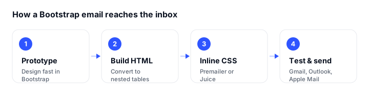
However, the core principles of Bootstrap (modularity, responsiveness, and reusability) remain just as powerful when building HTML email templates. By applying a Bootstrap-style framework to email development, you can maintain structure, consistency, and scalability across your templates while ensuring cross-client compatibility.
This guide is the code hub of our email cluster. It explains how to apply Bootstrap-inspired techniques to HTML email, gives you one complete copy-paste responsive template, and shows which techniques actually render in Gmail, Outlook, and Apple Mail.
A quick but important caveat before we start: Bootstrap is excellent for prototyping email layouts and reasoning about structure, but you should not ship Bootstrap’s compiled CSS or its JavaScript components (carousels, modals, accordions, tooltips) inside a production email. Gmail and Outlook strip <script> tags and most CSS, and neither flexbox nor CSS grid runs reliably in the major desktop clients, so production emails must be rebuilt with table-based, inlined HTML. Everything below shows how to translate Bootstrap’s concepts into that format.
Understanding the Constraints of Email Layouts
Unlike web browsers, email clients use older rendering engines and inconsistent CSS support. Gmail strips external stylesheets (<link rel="stylesheet">) entirely, and it will drop your entire <style> block if it exceeds roughly 8KB or contains an invalid rule. Gmail does support embedded <style> tags and media queries in its web and modern mobile clients, but inline CSS remains the only fully reliable baseline.
That means developers cannot rely on Bootstrap’s default classes, full flexbox grid, or JavaScript components. Instead, email templates must use inline CSS, table-based layouts, and simplified markup to render reliably.
Bootstrap’s grid system still offers value conceptually. You can replicate its column-based approach using nested tables and percentage widths, which is exactly what the template below does.
The Complete Responsive Email Template
Here is a full, production-shaped template you can copy and adapt: a header, a hero section, a two-column section that stacks on mobile, a bulletproof button, and a footer. The styles are written inline (the reliable baseline) with a small <style> block in the head for the mobile media query as progressive enhancement.
Replace the placeholder URLs, colors, and copy with your own. The outer container is capped at 600px, the standard email content width.
<!DOCTYPE html>
<html lang="en" xmlns="http://www.w3.org/1999/xhtml">
<head>
<meta charset="utf-8">
<meta name="viewport" content="width=device-width, initial-scale=1">
<meta http-equiv="X-UA-Compatible" content="IE=edge">
<title>Email title</title>
<style>
/* Progressive enhancement: ignored by clients that strip <style>,
so the inline styles must already produce a usable layout. */
@media only screen and (max-width: 600px) {
.stack-column {
display: block !important;
width: 100% !important;
max-width: 100% !important;
}
.mobile-padding { padding: 16px 20px !important; }
}
</style>
</head>
<body style="margin:0;padding:0;background-color:#f4f4f7;">
<!-- Wrapper: full-width background -->
<table role="presentation" width="100%" cellspacing="0" cellpadding="0" border="0"
style="background-color:#f4f4f7;">
<tr>
<td align="center" style="padding:24px 12px;">
<!-- Container: capped at 600px -->
<table role="presentation" width="600" cellspacing="0" cellpadding="0" border="0"
style="width:100%;max-width:600px;background-color:#ffffff;border-radius:8px;">
<!-- Header -->
<tr>
<td align="center" style="padding:24px 30px;background-color:#0d6efd;border-radius:8px 8px 0 0;">
<a href="https://example.com" style="text-decoration:none;">
<img src="https://example.com/logo.png" width="140" height="32" alt="Your Company"
style="display:block;border:0;height:auto;">
</a>
</td>
</tr>
<!-- Hero -->
<tr>
<td class="mobile-padding" style="padding:36px 40px 16px 40px;">
<h1 style="margin:0 0 12px 0;font-family:Arial,Helvetica,sans-serif;font-size:26px;line-height:1.3;color:#1a1a2e;">
Your responsive headline
</h1>
<p style="margin:0;font-family:Arial,Helvetica,sans-serif;font-size:16px;line-height:1.6;color:#444444;">
A short supporting sentence that explains the offer or update and gives readers a reason to keep going.
</p>
</td>
</tr>
<!-- Two-column section (stacks on mobile) -->
<tr>
<td class="mobile-padding" style="padding:8px 40px 24px 40px;">
<table role="presentation" width="100%" cellspacing="0" cellpadding="0" border="0">
<tr>
<!-- Column 1 -->
<td class="stack-column" width="50%" valign="top"
style="padding:12px 12px 12px 0;font-family:Arial,Helvetica,sans-serif;">
<h2 style="margin:0 0 8px 0;font-size:18px;line-height:1.3;color:#1a1a2e;">Column one</h2>
<p style="margin:0;font-size:15px;line-height:1.6;color:#555555;">
This cell is set to 50% width on desktop and drops to 100% on mobile.
</p>
</td>
<!-- Column 2 -->
<td class="stack-column" width="50%" valign="top"
style="padding:12px 0 12px 12px;font-family:Arial,Helvetica,sans-serif;">
<h2 style="margin:0 0 8px 0;font-size:18px;line-height:1.3;color:#1a1a2e;">Column two</h2>
<p style="margin:0;font-size:15px;line-height:1.6;color:#555555;">
Because each cell carries the stack-column class, the media query forces both to block on small screens.
</p>
</td>
</tr>
</table>
</td>
</tr>
<!-- Bulletproof button -->
<tr>
<td align="center" style="padding:8px 40px 40px 40px;">
<table role="presentation" cellspacing="0" cellpadding="0" border="0" align="center">
<tr>
<td align="center" bgcolor="#0d6efd" style="border-radius:6px;">
<a href="https://example.com/action"
style="display:inline-block;padding:14px 32px;font-family:Arial,Helvetica,sans-serif;font-size:16px;font-weight:bold;color:#ffffff;text-decoration:none;border-radius:6px;">
View details
</a>
</td>
</tr>
</table>
</td>
</tr>
<!-- Footer -->
<tr>
<td align="center" style="padding:24px 30px;background-color:#f4f4f7;border-radius:0 0 8px 8px;">
<p style="margin:0 0 8px 0;font-family:Arial,Helvetica,sans-serif;font-size:13px;line-height:1.5;color:#888888;">
Your Company, 123 Example Street, City, Country
</p>
<p style="margin:0;font-family:Arial,Helvetica,sans-serif;font-size:13px;line-height:1.5;color:#888888;">
<a href="https://example.com/unsubscribe" style="color:#0d6efd;text-decoration:underline;">Unsubscribe</a>
•
<a href="https://example.com/preferences" style="color:#0d6efd;text-decoration:underline;">Update preferences</a>
</p>
</td>
</tr>
</table>
<!-- /Container -->
</td>
</tr>
</table>
<!-- /Wrapper -->
</body>
</html>
Two details make this template work everywhere. First, every column cell carries the stack-column class, so the media query can flip both to full width at once: a two-column layout that only styles one cell will not stack cleanly. Second, the button is a “bulletproof” pattern where the background color lives on the <td> (via bgcolor and inline border-radius) and the link fills it with padding, so it still renders as a solid block even where the rounded corners are dropped.
Applying Bootstrap Concepts to Email Design
If you want to understand the template piece by piece, here is how each Bootstrap idea maps onto table markup.
1. Container
In Bootstrap, .container defines the maximum layout width. For email, use a table-based container with a fixed width, typically 600px:
<table role="presentation" width="100%" cellspacing="0" cellpadding="0">
  <tr>
    <td align="center">
      <table role="presentation" width="600" cellspacing="0" cellpadding="0" style="width:100%;max-width:600px;">
        <!-- email content -->
      </table>
    </td>
  </tr>
</table>
This maintains consistent spacing across email clients while staying responsive on mobile.
2. Grid and Columns
Bootstrap 5’s grid system uses flexbox (the current stable release is 5.3.8), but emails must rely on nested tables. The key is to make the columns stack on small screens.
Example two-column layout with a stacking class on every cell:
<table role="presentation" width="100%" cellspacing="0" cellpadding="0">
  <tr>
    <td class="stack-column" width="50%" valign="top" style="padding:10px;">
      <!-- Column 1 content -->
    </td>
    <td class="stack-column" width="50%" valign="top" style="padding:10px;">
      <!-- Column 2 content -->
    </td>
  </tr>
</table>
The matching media query stacks them on mobile by forcing each cell to full-width block:
@media only screen and (max-width: 600px) {
  .stack-column {
    display: block !important;
    width: 100% !important;
    max-width: 100% !important;
  }
}
Some clients ignore media queries (Outlook on Windows being the main one), but in those clients the cells simply stay side by side at 50%, which is still a valid layout. On Gmail, Apple Mail, and modern mobile clients the query fires and the columns stack. This is graceful degradation rather than breakage.
3. Utility Classes (Inline Equivalents)
Bootstrap’s spacing utilities (.p-3, .mt-4, and so on) can be replicated inline for email:
<td style="padding:20px 30px;">
  <p style="margin:0 0 10px 0;font-size:16px;line-height:1.5;color:#333;">
    Bootstrap-style padding and margin, but inline for compatibility.
  </p>
</td>
When building multiple templates, keep a JSON or template data map for spacing values to maintain consistency across your builds, similar to how Bootstrap defines its utility scales.
4. Typography
Bootstrap uses rem-based scaling and modern web fonts, but for email you will need web-safe fonts and fixed pixel sizes. A Bootstrap-like typographic hierarchy can still be achieved:
<h1 style="font-family:Arial,Helvetica,sans-serif;font-size:24px;font-weight:bold;margin:0 0 10px 0;">Heading 1</h1>
<p style="font-family:Arial,Helvetica,sans-serif;font-size:16px;line-height:1.5;margin:0 0 20px 0;">Body text for email layout</p>
Maintain consistent sizing (14 to 24px range) to ensure readability across Gmail, Outlook, and Apple Mail. Always declare the font stack inline on each text element, because Outlook on Windows falls back to Times New Roman when no family is set.
Email Client Support for These Techniques
Email clients do not share a rendering engine, so the same code behaves differently across inboxes. Outlook on Windows is the strictest because it renders with Microsoft Word’s engine, which is why table-based layout (not flexbox or grid) is the foundation here. The table below summarizes how the techniques in this guide hold up.
| Technique | Gmail (web/app) | Apple Mail / iOS | Outlook Windows (Word) | Outlook.com | Mobile (default apps) |
|---|---|---|---|---|---|
| Inline CSS | Full | Full | Full | Full | Full |
| Table-based layout | Full | Full | Full | Full | Full |
<style> block in head |
Yes (drops if >8KB or invalid) | Yes | Stripped | Partial | Yes |
@media queries (stacking) |
Yes (modern clients) | Yes | No (stays side by side) | No | Yes |
| Bulletproof button | Full | Full | Full (corners may square off) | Full | Full |
border-radius |
Yes | Yes | No (renders square) | Partial | Yes |
| Web fonts | Partial | Yes | No (web-safe fallback) | No | Partial |
| Background images on cells | Partial | Yes | No (needs VML fallback) | Partial | Partial |
| Flexbox / CSS grid | No | No | No | No | No |
| Bootstrap JS components | No | No | No | No | No |
The takeaway: build on the rows marked “Full” everywhere, treat the <style> block and media queries as enhancement, and never depend on flexbox, grid, or any JavaScript. Anything that needs a rounded corner or a web font should still look acceptable when Outlook squares it off or swaps the font.
Building Reusable Components
Like Bootstrap components, your email templates should include reusable elements such as buttons, headers, and content cards. The button below is the same bulletproof pattern used in the full template, isolated so you can drop it anywhere:
<table role="presentation" cellpadding="0" cellspacing="0" align="center">
  <tr>
    <td align="center" bgcolor="#0d6efd" style="border-radius:6px;">
      <a href="#" style="display:inline-block;padding:14px 32px;font-family:Arial,Helvetica,sans-serif;font-size:16px;font-weight:bold;color:#ffffff;text-decoration:none;border-radius:6px;">
        View details
      </a>
    </td>
  </tr>
</table>
This mirrors Bootstrap’s .btn component but is coded with pure HTML tables for inbox compatibility. The background color sits on the <td> so the button still fills with color in clients that drop the link’s border-radius.
Version Control and Maintenance
Just as Bootstrap encourages modular SCSS and reusable partials, developers should manage email templates with version control. For more on this engineering-focused workflow, see our guide to Bootstrap email marketing for developers.
Store template components (headers, footers, modules) in a repository. Use a build step with a CSS inliner such as Juice or Premailer (or a dedicated email framework like MJML or Maizzle) to compile your <style> rules into inline attributes and generate production-ready HTML. This lets you author in a Bootstrap-like component style and ship the inlined, table-based output that clients require.
When updates occur, your build process should recompile all templates to ensure consistent output across campaigns.
Testing in Gmail and Other Clients
Once your templates are built, testing inside Gmail is essential since it is one of the most common email clients. The support table above is a starting point, but real inboxes still surprise you, so preview before every send.
For a free, no-account check, paste your HTML into a validator like HTML Email Check to catch unsupported CSS and broken markup, or use the generous free tier of Mailtrap’s Email Sandbox to capture test sends and inspect how the HTML renders without spamming real inboxes. These cover the common cases at no cost.
If you want previews rendered across dozens of real clients at once, paid services such as Litmus or Email on Acid screenshot your email in 70 or more environments. That depth is useful for complex campaigns but is usually overkill for a single transactional template.
For teams that work directly inside Gmail, an integrated add-on such as Email Templates for Gmail by Designmodo lets non-technical users import and preview Bootstrap-style templates, edit text, images, and colors without touching the structure, and send test messages while preserving responsive design integrity. If you are planning broader campaigns, our overview of email marketing with Bootstrap covers how these templates fit into a wider strategy.
Accessibility and Best Practices
Bootstrap emphasizes accessibility, and the same applies to email:
- Use
role="presentation"for layout tables so screen readers skip the grid scaffolding. - Include
alttext for all images, since many clients block images by default. - Maintain sufficient contrast between text and background.
- Avoid relying solely on color for conveying information.
- Provide large clickable areas for buttons (at least 44 by 44 px).
- Set
langon the<html>element so screen readers use the correct pronunciation.
These standards ensure your templates are both readable and inclusive across devices and users.
Conclusion
While Bootstrap itself cannot be applied directly to HTML email, its design philosophy (modularity, scalability, and consistency) translates perfectly.
By adopting a Bootstrap-style structure, developers can build email systems that are:
- Responsive and mobile-ready, with two-column sections that stack cleanly
- Maintainable through modular, version-controlled architecture
- Easy to integrate into Gmail or marketing platforms
Start from the complete template above, lean on the techniques marked “Full” in the support table, and verify each send with a free preview tool before it goes out. With the right structure and workflow, you can bring Bootstrap’s reliability into the unpredictable world of email clients.
FAQ
Why can’t I use Bootstrap directly in email?
Gmail and Outlook strip external stylesheets and JavaScript, and none of the major desktop clients run flexbox or CSS grid, so Bootstrap’s classes, grid, and interactive components (carousels, modals, accordions) do not apply inside an inbox. Bootstrap is great for prototyping the layout, but you replicate its concepts in production using inline CSS and nested tables.
Does Gmail support media queries?
Yes. Gmail supports embedded <style> blocks and media queries in its web and modern mobile clients, so you can use them as progressive enhancement. Inline styles should still be your reliable baseline, since Gmail drops a <style> block that is invalid or larger than roughly 8KB.
What is the standard width for an HTML email?
600px is the widely used maximum content width. Build your outer container as a centered table set to width:100%;max-width:600px; so it stays responsive on mobile while keeping a consistent layout on desktop.
How do I make a two-column email responsive?
Put a stacking class (for example stack-column) on every column cell, then add a max-width:600px media query that switches those cells to display:block; and width:100%;. Applying the class to both cells, not just one, is what makes the two columns collapse into a single vertical stack on small screens. In clients that ignore media queries, such as Outlook on Windows, the cells stay side by side at 50%, which is still a valid fallback.
How do I test an email template for free?
Paste your HTML into a free validator like HTML Email Check to flag unsupported CSS, or capture test sends with the free tier of Mailtrap’s Email Sandbox to inspect rendering without hitting real inboxes. Paid services such as Litmus or Email on Acid add screenshots across 70-plus real clients when you need that depth for complex campaigns.
Why does my button or rounded corner look wrong in Outlook?
Outlook on Windows renders with Microsoft Word’s engine, which ignores border-radius and renders corners square. Use the bulletproof pattern where the background color lives on the <td> (via bgcolor) so the button still appears as a solid, tappable block even when the rounded corners are dropped.
Build your Bootstrap theme
Design a custom Bootstrap 5 theme visually with a live preview, then export clean Sass or CSS.
Open the Builder