July Newsletter Ideas with Bootstrap 5 (Code + Email Fallbacks)
July is peak summer: vacations, holiday sales, long weekends, and mid-year resets. That gives you plenty of angles for engaging July newsletters, and Bootstrap 5 is a fast way to prototype them with its responsive grid, cards, and utilities. This guide pairs each idea with real Bootstrap 5 code and, where the component relies on JavaScript or modern CSS, an email-safe fallback you can actually ship to an inbox.
Bootstrap is for the prototype, not the inbox. Bootstrap is excellent for building the web-viewable version of a newsletter (landing pages and “view in browser” links). But most email clients, including Gmail, Outlook, Apple Mail, and Yahoo, strip JavaScript and ignore the bulk of modern CSS. JS-driven components (carousel, accordion, masonry) and flex- or grid-based layouts will degrade or break inside an inbox. The pattern that works: design and preview in Bootstrap, then export to inline-styled, table-based HTML before you send. See our guides to Bootstrap email HTML templates and responsive email templates for Gmail for production-ready markup.
Each section below is marked Inbox-safe (renders in email after table/inline conversion) or Web-only (use it on the landing page; ship a fallback in the email). The fallback is listed right next to the snippet so there is no guesswork at send time.
July hooks and subject lines at a glance
Plan the month before you build it. These are the reliable July moments, with subject-line starting points you can adapt:
| Date | Hook / observance | Subject line idea |
|---|---|---|
| Jul 1 | Canada Day | “Happy Canada Day: 24 hours, true north savings” |
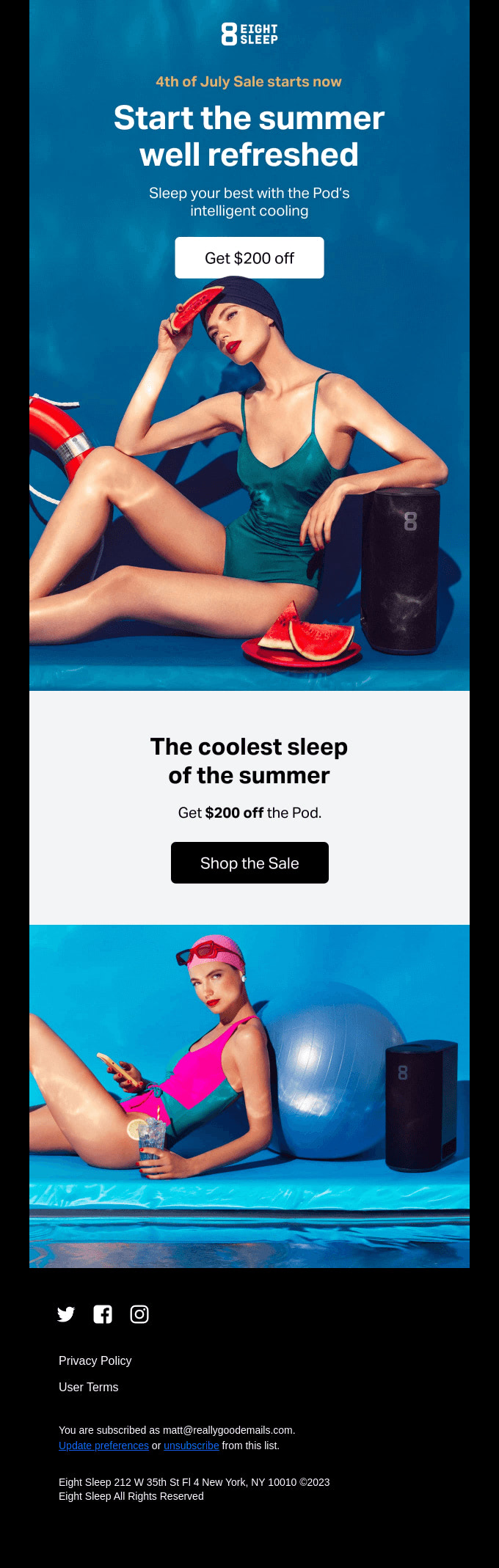
| Jul 4 | Independence Day (US) | “Code FREEDOM: 40% off through the 4th” |
| Jul 4 weekend | Long-weekend sale | “Your long weekend just got 40% better” |
| Jul 7 | World Chocolate Day | “Treat yourself: sweet picks for World Chocolate Day” |
| Jul 11 | Mid-year point | “Halfway through 2026: how are those goals?” |
| Jul 17 | World Emoji Day | “We summed up summer in 3 emoji” |
| Jul 24 | Summer travel peak | “Pack light, save big: our summer travel edit” |
| Jul 30 | Intl. Day of Friendship | “Bring a friend, both of you save” |
| All month | Summer clearance | “Summer styles, marked down before they’re gone” |
Tip: keep subject lines under about 45 characters so they are not truncated on mobile, and front-load the offer or hook.
Independence Day Celebrations
Inbox-safe. A card built from a table with inline styles works in email; the example below is the Bootstrap prototype.
Use Bootstrap’s card component for patriotic-themed content:
<div class="card text-white bg-primary mb-3">
  <div class="card-header">Celebrate Independence Day!</div>
  <div class="card-body">
    <h5 class="card-title">Fourth of July Sale</h5>
    <p class="card-text">Enjoy 40% off sitewide with code: FREEDOM</p>
    <a href="#" class="btn btn-light">Shop Now</a>
  </div>
</div>
Email-safe version: rebuild the same card as a single-cell table with the color and padding inlined, since email clients ignore bg-primary and the .card class:
<table role="presentation" width="100%" cellpadding="0" cellspacing="0">
  <tr>
    <td style="background:#0d6efd; color:#ffffff; padding:24px; border-radius:8px; font-family:Arial, sans-serif;">
      <p style="margin:0 0 4px; font-size:14px;">Celebrate Independence Day!</p>
      <h2 style="margin:0 0 8px; font-size:22px;">Fourth of July Sale</h2>
      <p style="margin:0 0 16px;">Enjoy 40% off sitewide with code: FREEDOM</p>
      <a href="https://example.com/sale" style="background:#ffffff; color:#0d6efd; padding:10px 18px; border-radius:6px; text-decoration:none; font-weight:bold;">Shop Now</a>
    </td>
  </tr>
</table>
Summer Travel Series
Web-only grid, inbox-safe fallback. Bootstrap’s flex-based grid collapses unpredictably in Outlook. Use the grid for the landing page; stack the cards as table rows for email.
Create a responsive grid for destination spotlights:
<div class="row row-cols-1 row-cols-md-3 g-4">
  <div class="col">
    <div class="card h-100">
      <img src="destination1.jpg" class="card-img-top" alt="Destination 1">
      <div class="card-body">
        <h5 class="card-title">Hidden Beach Paradise</h5>
        <p class="card-text">Discover this secluded beach getaway...</p>
      </div>
    </div>
  </div>
  <!-- Repeat for other destinations -->
</div>
Email-safe fallback: a multi-column table that gracefully stacks to one column on narrow screens. Outlook respects align/width on table cells where it ignores flex:
<table role="presentation" width="100%" cellpadding="0" cellspacing="0">
  <tr>
    <td width="50%" valign="top" style="padding:8px; font-family:Arial, sans-serif;">
      <img src="destination1.jpg" alt="Hidden Beach Paradise" width="100%" style="display:block;">
      <h3 style="margin:8px 0 4px; font-size:18px;">Hidden Beach Paradise</h3>
      <p style="margin:0;">Discover this secluded beach getaway...</p>
    </td>
    <td width="50%" valign="top" style="padding:8px; font-family:Arial, sans-serif;">
      <img src="destination2.jpg" alt="Mountain Retreat" width="100%" style="display:block;">
      <h3 style="margin:8px 0 4px; font-size:18px;">Mountain Retreat</h3>
      <p style="margin:0;">Trade the heat for cool alpine air...</p>
    </td>
  </tr>
</table>
Beat the Heat
Inbox-safe. A list group is just styled list items; convert each to a table row and it renders everywhere.
Use Bootstrap’s list group for summer skincare tips:
<ul class="list-group">
  <li class="list-group-item active" aria-current="true">Summer Skincare Tips</li>
  <li class="list-group-item">Always wear sunscreen (SPF 30+)</li>
  <li class="list-group-item">Stay hydrated</li>
  <li class="list-group-item">Use a light, oil-free moisturizer</li>
  <li class="list-group-item">Exfoliate gently once a week</li>
</ul>
Summer Reading Challenge
Inbox-safe. The Bootstrap progress bar is CSS-only, but the percentage width is set with a class-driven style that some clients drop. Build the bar from two nested tables so the fill is reliable.
Use a progress bar to show reading challenge progress:
<h4>Summer Reading Challenge Progress</h4>
<div class="progress">
  <div class="progress-bar bg-success" role="progressbar" style="width: 70%;" aria-valuenow="70" aria-valuemin="0" aria-valuemax="100">70%</div>
</div>
Email-safe fallback: a fixed-width track table with an inner fill cell. No CSS classes, just inline background colors:
<table role="presentation" width="100%" cellpadding="0" cellspacing="0" style="background:#e9ecef; border-radius:6px;">
<tr>
<td width="70%" style="background:#198754; color:#ffffff; padding:6px 10px; border-radius:6px; font-family:Arial, sans-serif; font-size:13px;">70%</td>
<td width="30%"> </td>
</tr>
</table>
Outdoor Fitness Fun
Web-only grouping, inbox-safe fallback. card-group uses flexbox, so in email use the same stacked-table approach as the travel series.
Create cards for different outdoor workouts:
<div class="card-group">
  <div class="card">
    <img src="park-workout.jpg" class="card-img-top" alt="Park Workout">
    <div class="card-body">
      <h5 class="card-title">Park HIIT Routine</h5>
      <p class="card-text">High-intensity interval training using park benches and open spaces.</p>
    </div>
  </div>
  <!-- Repeat for other workout types -->
</div>
For the inbox, reuse the two-column travel table above, swapping in workout images and copy.
Summer Food Trends
Web-only (carousel), inbox-safe fallback. The Bootstrap carousel needs JavaScript, which every major email client strips. Do not put a carousel in an email: it will show a single static frame at best, a broken block at worst.
Use a carousel to showcase seasonal recipes on the landing page:
<div id="recipeCarousel" class="carousel slide" data-bs-ride="carousel">
  <div class="carousel-inner">
    <div class="carousel-item active">
      <img src="summer-salad.jpg" class="d-block w-100" alt="Summer Salad">
      <div class="carousel-caption d-none d-md-block">
        <h5>Refreshing Summer Salad</h5>
        <p>A light and crisp salad perfect for hot days.</p>
      </div>
    </div>
    <!-- Add more carousel items for other recipes -->
  </div>
  <!-- Add carousel controls -->
</div>
Email-safe fallback: replace the carousel with a single animated GIF that cycles through the recipe photos, or a static “hero” image linking to the full gallery. GIFs animate in Gmail, Apple Mail, and Yahoo; Outlook on Windows shows the first frame, so make sure that frame works on its own:
<a href="https://example.com/summer-recipes">
  <img src="summer-recipes.gif" alt="Three summer recipes: salad, grilled corn, berry tart"
       width="600" style="display:block; max-width:100%;">
</a>
Eco-Friendly Summer Living
Inbox-safe. Tables are the one structure every email client renders well, which is why production emails are built from them. Inline the borders and striping.
Create a table for water conservation tips:
<table class="table table-striped">
  <thead>
    <tr>
      <th scope="col">Tip</th>
      <th scope="col">Water Saved</th>
    </tr>
  </thead>
  <tbody>
    <tr>
      <td>Fix leaky faucets</td>
      <td>Up to 20 gallons per day</td>
    </tr>
    <!-- Add more rows -->
  </tbody>
</table>
Summer Fashion Lookbook
Web-only (masonry), inbox-safe fallback. The data-masonry attribute requires the separate Masonry JavaScript library on top of Bootstrap. It is great for a web lookbook and impossible in email.
Implement a masonry-style layout for fashion items on the landing page:
<div class="row" data-masonry='{"percentPosition": true }'>
  <div class="col-sm-6 col-lg-4 mb-4">
    <div class="card">
      <img src="summer-dress.jpg" class="card-img-top" alt="Summer Dress">
      <div class="card-body">
        <h5 class="card-title">Floral Summer Dress</h5>
        <p class="card-text">Perfect for beach days and summer parties.</p>
      </div>
    </div>
  </div>
  <!-- Repeat for other fashion items -->
</div>
Email-safe fallback: a fixed two-column image grid built from a table. Uniform image sizes keep it clean since email cannot reflow a true masonry layout:
<table role="presentation" width="100%" cellpadding="0" cellspacing="0">
  <tr>
    <td width="50%" style="padding:6px;"><img src="summer-dress.jpg" alt="Floral Summer Dress" width="100%" style="display:block;"></td>
    <td width="50%" style="padding:6px;"><img src="linen-shirt.jpg" alt="Linen Shirt" width="100%" style="display:block;"></td>
  </tr>
  <tr>
    <td width="50%" style="padding:6px;"><img src="straw-hat.jpg" alt="Straw Hat" width="100%" style="display:block;"></td>
    <td width="50%" style="padding:6px;"><img src="sandals.jpg" alt="Sandals" width="100%" style="display:block;"></td>
  </tr>
</table>
Mid-Year Goal Check-In
Web-only (form), inbox-safe fallback. Interactive forms and the range slider do not submit from inside most inboxes. Apple Mail allows some interactivity, but Gmail and Outlook do not, so route readers to a hosted form instead.
Create a form for users to update their goals on a landing page:
<form>
  <div class="mb-3">
    <label for="goalInput" class="form-label">Update Your Mid-Year Goal</label>
    <input type="text" class="form-control" id="goalInput" placeholder="Enter your updated goal">
  </div>
  <div class="mb-3">
    <label for="progressRange" class="form-label">Goal Progress</label>
    <input type="range" class="form-range" min="0" max="100" id="progressRange">
  </div>
  <button type="submit" class="btn btn-primary">Save Updates</button>
</form>
Email-safe fallback: a styled button (built as a table cell, often called a “bulletproof button”) that links to the hosted form:
<table role="presentation" cellpadding="0" cellspacing="0">
  <tr>
    <td style="background:#0d6efd; border-radius:6px;">
      <a href="https://example.com/midyear-checkin"
         style="display:inline-block; padding:12px 24px; color:#ffffff; font-family:Arial, sans-serif; text-decoration:none; font-weight:bold;">
        Update My Goal
      </a>
    </td>
  </tr>
</table>
A note on tabs and accordions in email
If your web version groups content into tabs or an accordion (for example, an FAQ block), neither works in most inboxes because both depend on JavaScript or the CSS checkbox hack that Gmail and Outlook block. The email-safe pattern is anchor links: a small table of contents at the top that jumps to in-message anchors, with all sections expanded inline.
<p style="font-family:Arial, sans-serif;">
Jump to:
<a href="#supplies">Supplies</a> |
<a href="#travel">Travel</a> |
<a href="#recipes">Recipes</a>
</p>
<h2 id="supplies">Supplies</h2>
<p>All your section content, shown inline (no collapsing).</p>
In-message anchors are inconsistent across clients (Outlook desktop often ignores them), so keep emails short enough that they are a convenience, not a requirement, and always expand the content rather than hiding it.
Including Bootstrap (web version only)
For the web-viewable version, include the Bootstrap CSS and JS:
<link href="https://cdn.jsdelivr.net/npm/bootstrap@5.3.8/dist/css/bootstrap.min.css" rel="stylesheet">
<script src="https://cdn.jsdelivr.net/npm/bootstrap@5.3.8/dist/js/bootstrap.bundle.min.js"></script>
And the viewport meta tag so the design scales to device width:
<meta name="viewport" content="width=device-width, initial-scale=1">
None of this travels with the email itself. Email clients do not load external stylesheets or run the bundle script, which is exactly why the inbox versions above are inlined and table-based.
By leveraging these Bootstrap components for the web version and the inline, table-based fallbacks for the inbox, you can ship responsive July newsletters that hold up in both places. Test across screen sizes and across email clients before you send: our guide to responsive email templates for Gmail covers the quirks worth checking first.
Planning the rest of the season? See June newsletter ideas for the previous month and August newsletter ideas, which covers back-to-school campaigns in depth, for what comes next.
FAQ
What should a July email newsletter include?
July newsletters work well around summer themes: an Independence Day or long-weekend promotion, a summer travel series, seasonal tips (skincare, recipes, eco-friendly living), a mid-year goal check-in, and lighter holiday hooks like World Chocolate Day or the Day of Friendship. Use the hooks-and-subject-lines table above to map dates to content, then build each block with Bootstrap cards, list groups, and grids for a clean, responsive layout.
How do I make a July newsletter mobile-responsive with Bootstrap?
Build the web version on Bootstrap’s responsive grid system using classes like row row-cols-1 row-cols-md-3, and include the viewport meta tag so the design scales to device width. For the emailed version, use single-column or stacked-table layouts with widths set on table cells, since email clients ignore flex and grid. Test across screen sizes before sending, and see our responsive email templates for Gmail for inbox-specific quirks.
Which Bootstrap components work best for email-style newsletters?
Static, CSS-light components translate best: cards, list groups, tables, and simple grids. Save these as inline-styled, table-based markup for production. Our Bootstrap email HTML templates article shows the conversion step by step.
Can I use Bootstrap JS components like the carousel or accordion in actual emails?
No, not reliably. Email clients such as Gmail and Outlook strip JavaScript and ignore most modern CSS, so the carousel, accordion, masonry layout, and interactive forms will break or degrade in an inbox. Use them for the web or landing-page version, and replace them with the static fallbacks shown above: an animated GIF instead of a carousel, anchor links instead of tabs or accordions, a hosted-form button instead of an in-email form, and a nested table instead of a CSS progress bar.
What are the best subject lines for a July newsletter?
Tie the subject to a specific July moment and front-load the offer: “Code FREEDOM: 40% off through the 4th” for Independence Day, “Your long weekend just got 40% better” for the holiday weekend, “Halfway through 2026: how are those goals?” for the mid-year point, and “Pack light, save big: our summer travel edit” for travel content. Keep them under about 45 characters so they are not truncated on mobile.
Should July or August cover back-to-school?
Hand back-to-school to August. July is better spent on summer themes (travel, Independence Day, mid-year goals) while readers are still in vacation mode; a back-to-school push lands harder closer to the season. Our August newsletter ideas article covers the supplies, clothing, and electronics angles in detail.
Build your Bootstrap theme
Design a custom Bootstrap 5 theme visually with a live preview, then export clean Sass or CSS.
Open the Builder